Brianna Connaghan
Fine Arts
Art projects over the years.

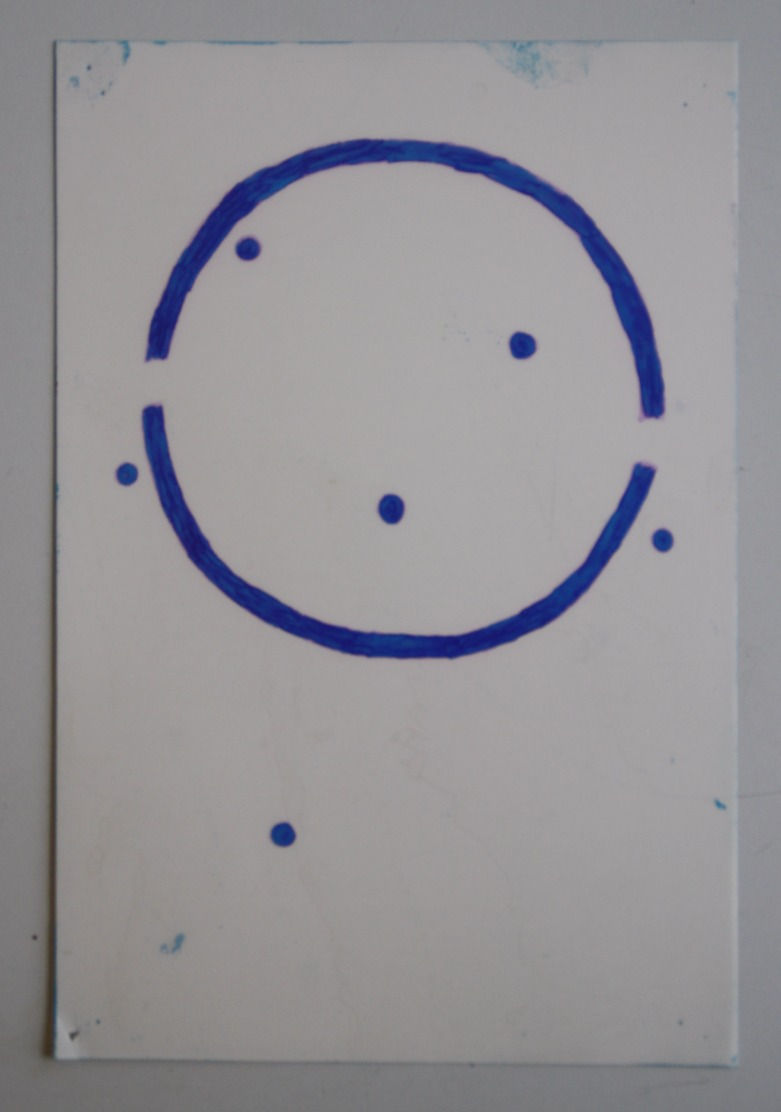
This print was created with a modern style of lithography call pronto printing. The theme for the print was autobiography. Each object on the dreamcatcher represents a part of my life.
The polyester plate is coated with a mixture of citric acid, gum arabic, and warm water. The coated is then applied to the plate after the drawing is finished; oil-based sharpie is best for drawing.

The original drawing was inspired by the face of Michael Fassbender.
This print was created with a modern style of lithography call pronto printing. The theme for the print was autobiography. Each object on the dreamcatcher represents a part of my life.
Printmaking Strategies
SPRING 2016: Further exploring of different print making techniques. Begain with pronto prints, moved into mono prints, then utilized woodcuts and calographs to create mixed-media prints.
This class challenged me to push my creativity and to improve on the composition of my prints.

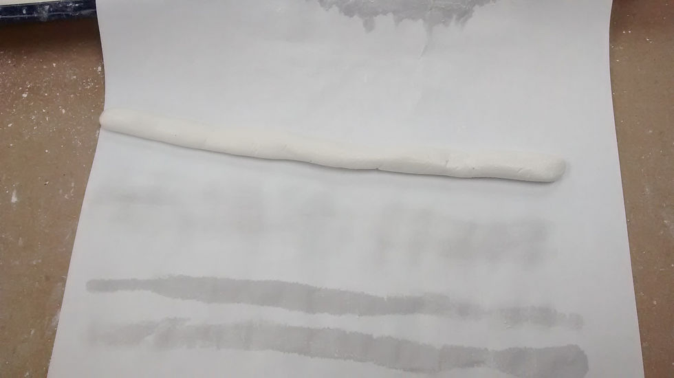
Reconstruction created using hand made iron gall ink and a quill cut from a goose feather. This one is a copy of: "Caricature with Mola Protecting Himself from Carlo Maratta Holding a Viper" - Pier Francesco Mola

This is an image of the original drawing presented for comparison, retrieved from: https://www.artsy.net/artwork/pier-francesco-mola-caricature-with-mola-protecting-himself-from-carlo-maratta-holding-a-viper/
Completion of white pastel.
Reconstruction created using hand made iron gall ink and a quill cut from a goose feather. This one is a copy of: "Caricature with Mola Protecting Himself from Carlo Maratta Holding a Viper" - Pier Francesco Mola
Western Drawing Techniques
FALL 2015: A lecture-studio presentation on materials and tools, supports and techniques of wet and dry media drawing in the West from about the year 1400 to the present. Topics include the development and manufacture of paper, pens, brushes, inks, watercolor paint, charcoal, metalpoint, graphite pencils, natural and fabricated chalks, pastels, erasers and fixatives. Studio reconstructions of masterworks, lectures and library research are.
It is important to note that the photographs of my work are paler on the screen than in real life.

The first print of the class was a woodcut. The class would begin with a drawing. Once the image was traced on the wood, we'd then cut out the negative space. Application of black ink and transference to the paper the paper would produce the print.

This is the final look of the stencil after enduring multiple applications of black ink.

Sometimes it was difficult to keep the colors from bleeding into each other. I do, however, prefer the clean colored print to this one just because of how important the dichotomy between the colors is for this message.
The first print of the class was a woodcut. The class would begin with a drawing. Once the image was traced on the wood, we'd then cut out the negative space. Application of black ink and transference to the paper the paper would produce the print.
Intro to Printmaking
FALL 2014: Techniques on different types of print making. We started with a basic woodcut, then moved onto reduction prints, to etching, and then ended with a few days focused on screen printing.
This class exposed me to an art medium I had never done before and allowed me to stretch my creative muscles while using fun yet challenging techniques.

Black and grey painting done of a decayed coconut in a glass jar. Black paint and thinner were the only things used for the work. I originally used a paint other than Windsor, but it was of poor quality and the black came out brown, which is why there is a brownish tint to the work.

This was our first attempt to use color. We were restricted to ivory black, titanium white, french ultramarine, and yellow ochre. I painted a mask I owned that sat on my blue scarf. As you can see, there was still a lot to learn about creating depth. This painting as well as the first one were done on canvas board.

The final product.
Black and grey painting done of a decayed coconut in a glass jar. Black paint and thinner were the only things used for the work. I originally used a paint other than Windsor, but it was of poor quality and the black came out brown, which is why there is a brownish tint to the work.
Intro to Painting
FALL 2014: This intro to painting class focused entirely on painting with oils while using thinners like mineral spirits and mediums. The class started with getting to know the medium to understanding warm vs. cool, dark vs. light, color contrast, and shadow.
Project Two to the Final were done using Winton and Windsor & Newton Oil Paint.

Outlined spaces that define an area. This picture was not included because I did not quite understand the concept at the time. It was also excluded because I thought it was a better example of Edge than Contour. It's an okay picture though.
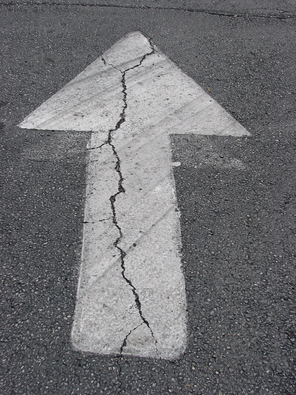
Lines running in a particular direction. The arrow was not included due to its obviousness.
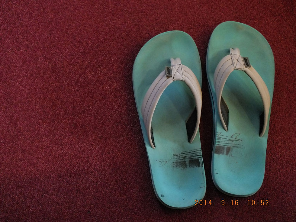
The two objects in this photo are in relationship with each other due to their hue and their position on the color wheel. The primary colors of red, blue, and yellow are in a triad position. The picture includes blue, red, grey, and black; any yellow included would be hidden within the blue of the flip-flops. The warmth of the darkly valued, red carpet brings the carpet forward while the coolness of the lightly valued, blue pushes the flip-flops back.
Outlined spaces that define an area. This picture was not included because I did not quite understand the concept at the time. It was also excluded because I thought it was a better example of Edge than Contour. It's an okay picture though.
Seeing & Being
FALL 2014: This class was not a typical art class. The first third of it was spent on terms found in visual communication. During that time, I took pictures of objects that contained these terms in action. Not all the terms, however, are shown. Being able to take pictures on the go ensured that I knew the terms we were studying well.
ELEMENTS - the basic components of an image
PRINCIPLES - the way the elements go together
ORGANIZATION - additional structural relationships that guide/direct the viewing experience